Tourism in Costa da Morte discloses a new image
09/08/2019
After a work in recent months that included the study of the needs of the tourism brand and its subsequent design, in which all the agents that make up the CMAT have been involved, we can now share our new corporate image.
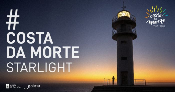
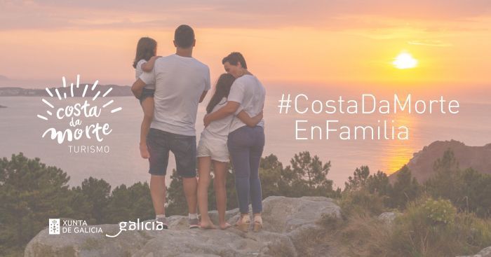
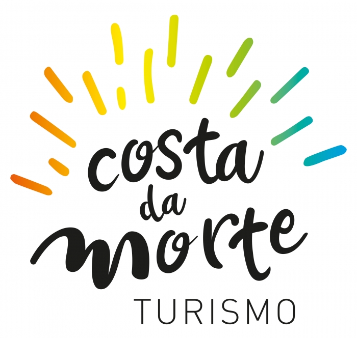
The first attention is drawn to a renewed and colorful symbol that takes distance from the previous image used to represent tourism in Costa da Morte. This new proposal, vivid and modern, aims to symbolize the wide variety of resources of the geodestine. The colorful lines seek to have a personal interpretation of those who see it: fireworks, a wave beating against a rock... The use of color also seeks to represent different feelings and realities that are present in Costa da Morte. From the blue of the sea to the orange of a sunset, through the green that represents the nature.
The so-called “logo” in technical terms, that is, the parts with phonetic reading also change with respect to the previous design. If in the former corporate image we could read "Costa da Morte. CMAT Tourism Association", the text is now condensed in "Costa da Morte” with a colorful and refined typography and a “Tourism” represented in a more sober way. This change supposes a reinforcement with the brand, which becomes more recognizable; especially among foreign publics.
This new corporate image that will identify tourism in Costa da Morte regionally, nationally and internationally will be present on our website, in posters, advertising, stationery, social networks ... and all spaces in which the brand can be presented. Its design is the work of the A Coruña based advertisement agency Galo Publicidad.